LookFar Labs19 August 2015
Gifs, Twitter, and Matching Visual Content to Brand
How the Right Visual Format Can Propel Engagement
It’s been a little more than a year since Twitter delivered gif capacity into their users’ quivering palms.
The result? Widespread adoption, mass enthusiasm, and an entirely new dimension to the little blue bird.
…unless you’re a brand.
After the initial explosion of popularity, when just about anyone could get away with using posting celebratory gifs of Daft Punk, a few big businesses showed just how incredibly attractive and shareable the bite-size video format is.
GIFs on @Twitter! pic.twitter.com/acnifU4Dpz
— Recording Academy (@RecordingAcad) June 18, 2014
My personal favorite? Wendy’s. The fast food giant showed a fine grasp of what makes gifs great by creating something offbeat, company-related, and optimized for repetition – a key factor distinguishing gifs from other video. Shares were deservedly through the roof.
But since that early enthusiasm, few brands have had the nerve to bet heavy on the gif. Why?
- Competition. Instagram and Snapchat are both heavily oriented toward short-form video content. They’re also new, sexy platforms, and look pretty nice on . Marketers, unsurprisingly, like all of those things.
- The format can be a little intimidating. Gifs are one of those ineffable internet institutions that just don’t always lend themselves to corporate use.
- Heavy dependence on repetition.
- Continuing frustrations with Twitter’s interface.
Or maybe it’s just the fact that marketers are notoriously stupid about online fads.
Whatever the case, gifs seem to be taking a back seat to other visual formats.
But sometimes, brands break the mold. A casual Twitter find has me rethinking the humble gif and makes a beautiful point about the importance of matching visual content to your brand.
How MLB Gifs Turns Highlights Into Shareable Content
I encountered the MLB Gifs Twitter feed during a recent Twitter spree and was immediately struck with how perfectly the account was making use of gifs.
Is this real life? pic.twitter.com/ry6bd9hrR3
— MLB GIFS (@MLBGIFs) August 19, 2015
Baseball has never been short on highlight moments. In fact, as a spectator sport, it relies on them – viewers will happily sit through commercials and relative periods of inactivity to see a single amazing catch.
The MLB Gifs account capitalizes beautifully on this dynamic. Instead of long-form video or extensive breakdowns of action, it uses gifs to zero in on the sport’s most exciting moments. Fan response to this format has been incredible. Each tweeted gif receives hundreds of RTs and favorites, and it’s not unusual to see triple digit interactions on a single post.
This gets even more impressive when MLB Gifs is matched up against MLB’s primary Twitter account.
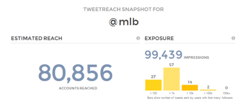
@MLB is a monster of a feed, and can boast 5.71 million followers, more than 30 times the count seen on @MLBGifs. It’s also beautifully managed, and mixes a deft social touch with the muscle of a true corporate titan.
You’d expect it to have some pretty impressive reach, and you wouldn’t be wrong; the surprise lies in how it stacks up against its smaller, gif-obsessed sister account.
A sampling of the primary handle’s last hundred tweets shows a reach of 80,856 accounts (big thanks to Union Metrics for their excellent TweetReach tool).
MLB Gifs, meanwhile, shows a reach of 32,831 accounts for their last hundred tweets.
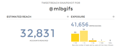
Sure, the second number is smaller, but here’s the thing: MLB Gifs may have only 3.3% of MLB’s follower count, but it still has over 40% of the bigger account’s reach.
That number indicates a massive disparity in audience engagement between the two accounts. MLB Gifs may not have the millions of the primary MLB account, but it has a vastly more enthusiastic, connected audience. As a marketing channel, it blows @MLB out of the water in terms of ROI.
This is the power of finding the right visual medium to deliver your brand’s message.
So You’re Not Into Baseball…
Buffer has long been a paragon of digital marketing done right. The social SaaS runs an amazing blog, finds influencer after influencer to tout their services, and has a history of simply playing the game better than anyone else in their field.
Their Twitter account is, unsurprisingly, well up to their very high standards. 356,000 followers should make just about any community manager happy, especially given Buffer’s early history as a small, bootstrapped brand.
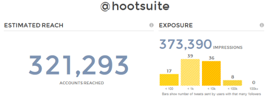
But it still doesn’t look all that impressive when stacked up against the follower count of another marketing software giant: Hootsuite.
Hootsuite’s mixture of savvy inbound practices and social incentives for users has won them an absurd 7.04 million audience members. Let that sink in – a social media monitoring service has more followers than the great American pastime.
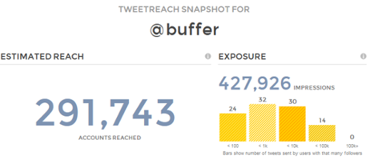
Compare reach, though, and those numbers swing right back in Buffer’s favor. The smaller service has only 5% of Hootsuite’s audience, but has more than 90% of their reach, and actually outranks them in terms of total exposure.
Another pair of similar feeds, another unfathomably deep disconnect between follower counts and actual productivity. Unlike the first pairing, there are plenty of factors at work here, but let’s zero in on visuals.
Both make constant use of graphics, in fact, I can’t find a recent tweet from either without an attached picture.
Hootsuite tends to post a variety of images, ranging from vans to telephones to memes. They’re also more than happy to dabble in gif and video formats. Buffer, meanwhile, is laser-focused. Each post is accompanied by either an impact headline of one of their articles, graphically doctored text, or most frequently, an infographic.
All due respect to Hootsuite, but Buffer wins this round.
Buffer’s choice of imagery rigidly conforms to their voice and appearance as a brand. Their use of visual data reinforces the mix of hard analytics and gorgeous UI that built them into an industry leader.
See what I mean about the power of visual formats?
Picking Your Brand’s Medium
Four test cases do not an ironclad argument make, but I do hope they at least illustrate the value of finding a format in line with your brand.
If you’re wondering exactly which platform to use, I’d recommend looking through the following to see if any make for a particularly good match with your brand:
- Canva remains one of the best options for amateur graphic designers. Completely online and easy to use, it’s a great way to imitate Buffer by creating visual headers and simple infographics.
- We’ve only briefly touched on Vine, but if you’re hoping to start pumping out video content, it really is one of your best options. Vines are simple to make and they’re designed for social sharing. Overall, a very good way to dip your toes into the wide world of video content.
- There’s plenty of graph-making software out there, but Infogr.am remains a personal favorite. Attractive, potent, free – what’s not to like?
- As for gifs, this is your chance to go mobile. Third-party apps – 5SecondsApp seems popular – abound, and make gif production much easier for the smartphone-savvy marketer.
Whether you’re using Canva-created impact headlines, Buffer-style infographics, Vines, gifs – heck, even Periscope – there’s value in picking something that fits and sticking with it.
Do all brands have to follow this single-minded adherence to a structure? No, certainly not. There are plenty of brilliant digital marketers that use a diverse set of visual tools to attract attention.
Still, if you find yourself lost amid various formats, it may be time to simplify and capitalize on one or two of the most potent ones.
Test, see what works, and start delighting your viewers all over again.
Written by
 How to Prioritize Color Accessibility in Product Design
  How to Prepare Data for Machine Learning